Over the course of 2021, we completed 18 website projects for Shopify brands. 18! (We can’t believe it either.)
Not to mention, on top of that is our ongoing CRO work for clients (12 in total).
Yes, it’s been a busy year, but we’re thrilled with the results.
As a small but mighty team, nothing makes us more proud than to look at how much we accomplished this year—and what our clients have accomplished too.
We want to share some of these projects with you. It’s our little way of celebrating and showing off the amazing work done by our team.
Without further ado, let’s look at some of our website projects from 2021.
Fav’s from the Fuel Made team
I asked our website team to share their favorite project they worked on this year. Here are their answers:
1. Turbie Twist
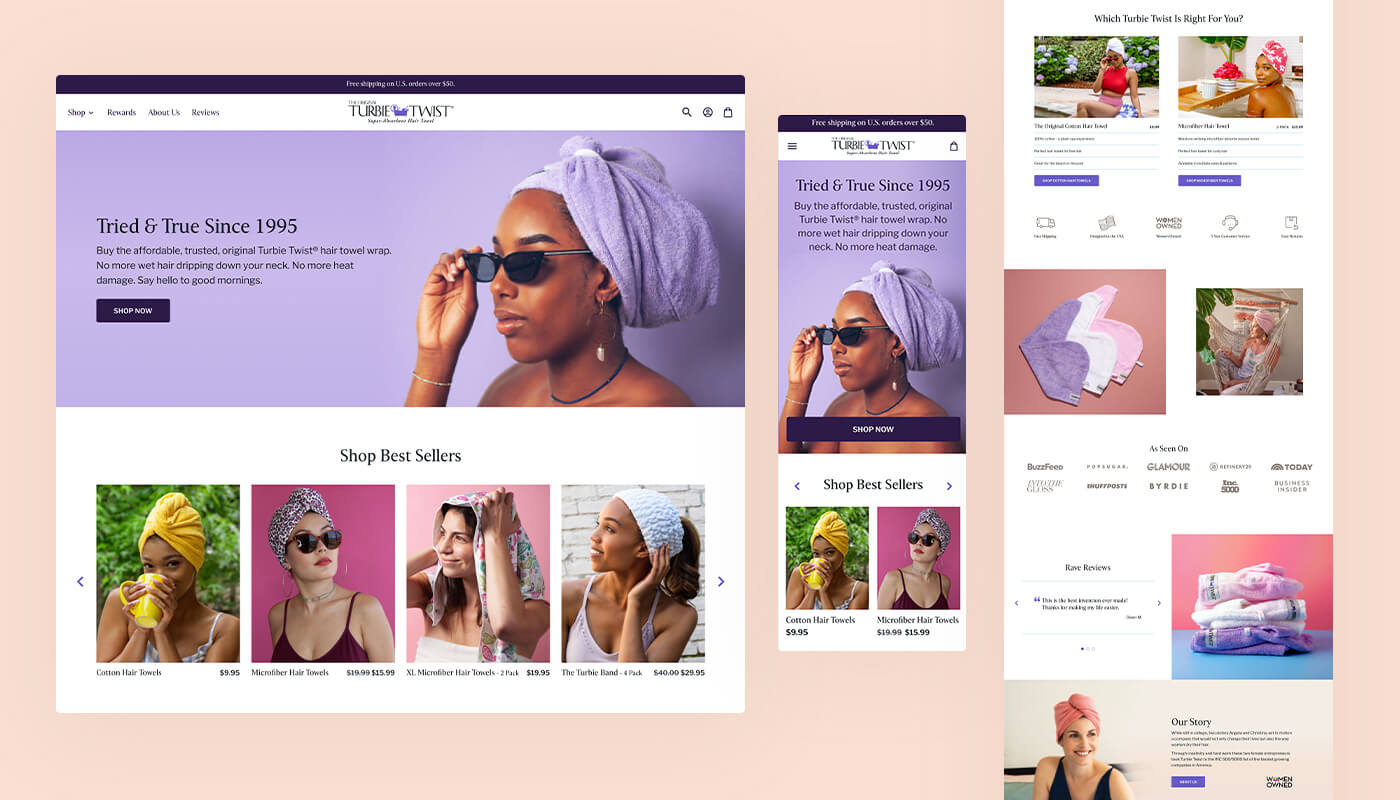
With Turbie Twist, we focused on a beautiful site update where we could elevate the branding and make the shopping experience fun.
“It was such a great opportunity to work with a well-known brand, and I'm so happy with how it turned out. They were a fun client to work with; just really delightful,” said Kellie, our UX and visual designer. “Seeing the client’s excitement at the updated UI—while staying true to the established branding—was really gratifying too.”

Turbie Twist launched on Shopify 2.0, which brought exciting new challenges for our team.
“Working with new 2.0 features and being able to come up with the way the project was built and packaged also made the dev process more challenging and interesting. Also, I totally own the product and use them every day, so that's always nice.”
- Lacey, developer at Fuel Made

By showcasing more product attributes on the PDPs and sharing more information, we help Turbie Twist’s customers feel confident about choosing a product to purchase.
“It was one of our first Shopify 2.0 projects to launch! Which was super exciting. I got to have my first look at 2.0 and dig into all the new features.” said Lauren, project manager.
2. Keymaster Games

The purpose of the website redesign for Keymaster Games was all about translating the immersive experience of playing a board game onto a website.
To do this, we added fun interactive elements as users scroll through the website. We also focused on telling the story of each game and building a resource for the Keymaster Games community.
“Keymaster has an amazing design and cool features. I was working on Shopify 2.0 first time, and I choose to work from scratch. It’s the first site where I didn’t take any prebuilt theme or CSS framework.”
- Yogesh, developer at Fuel Made

3. Spicy Ice
We launched Spicy Ice’s new website back in 2020, but since then have continued to do ongoing maintenance and updates to improve its conversion rate.
Earlier this year, we learned there was a friction point for customers who purchased a pendant and thought a chain was automatically included. This was an opportunity to figure out the best way to let customers know they aren’t included and to upsell the gold chains when customers are purchasing a pendant.
After running a 3-way A/B test, we discovered the best way to let customers know the chain is sold separately is to include a “select your chain” section on every pendant’s PDP. This way users can decide to add it on when they add the pendant to their cart, or they can simply ignore it.

This not only drove up Spicy Ice’s AOV on pendant purchases, but it also lessened the number of support requests the team gets about pendants and chains.
4. Sunday Afternoons

Our project with Sunday Afternoons consisted of migrating their store over to Shopify from another platform. From there, we helped them set up third-party apps and integrations, including Re:amaze for live chat, Launchpad, and Boost for product search and filtering.
Part of the reason why we enjoyed this project so much is because “the clients are a delight,” according to our developer Marianne.

5. Petalura

Petalura is another full website redesign we launched some time ago but have continued to make ongoing improvements. One project we did this year was to create a variety of add-to-cart CTA options.
Because Petalura has many states for inventory—in stock, out of stock, coming soon—they wanted customers to have the option to get notified when an out-of-stock item comes back in stock, and to be able to preorder items that are being released soon.
We built this functionality based on the stock status in Petalura’s back-end. On the front-end, Petalura’s website automatically updates the messaging on the product page and cart to reflect that.
Also, the preorder functionality is divided into four sections that are segmented based on pre-order quantity available and date. To this, our developer Erick said, “I have never worked with so many add to cart button options!”
Notable mentions
Out of 18 projects, we don’t want to show off just five. There are so many other designs worth mentioning, so here are an additional four:
6. SASNola

SASnola is a soft leather shoe company started by two friends, Terry Armstrong and Lew Hayden. The value behind SAS’s products is the quality and comfort of the shoes, so this information was important to highlight on the homepage.
With a large product catalog, it’s key for customers to be able to discover the type of shoe they’re looking for easily. SAS’s product pages have a detailed filtering system to help with that.

7. Schoolhouse
Schoolhouse is a lighting and lifestyle goods manufacturer. Their product categories range from lighting, hardware, home decor, and goods for the bedroom and bathroom. There are many products and specific PDPs that we needed to make easily accessible to customers.

For this project, we created a design-forward website that focuses on robust product page forms to allow users to move through the process of purchasing the exact product they need. Customers can easily navigate between different colors and styles on individual PDPs before they add an item to their cart.

8. Shuler Studio

For Shuler Studio, a brand specializing in monograms, fonts, and designs, our focus was on creating a simplistic, beautiful on-site experience with a clearer path for customers to discover the right collections for their needs. We created high-end visuals to complement the customer's browsing journey.

9. Live Bearded

The inspiration behind Live Bearded was to “create a company that was based on the idea and values of brotherhood.” To achieve this, the founders treat every customer like a brother—and that meant creating an extraordinary customer experience.
On the website, we focused on the benefits for customers, highlighting Live Bearded’s 365-day return policy, lifetime warranty, and free shipping over $45. The homepage also shares why the brand exists, links to blog posts that educate customers, and explains where users can follow the brotherhood.

Looking for custom Shopify development and design? We can help
Our specialty is premium Shopify design, development, and growth strategy consulting. When you hire us, you get the personal, devoted attention of our talented team working to help you achieve your goals.
You can learn more about what we do by visiting our services page. Or, check out more of our previous projects by visiting our portfolio page.
